
Interactive Site Plan (ISP) Case Study
Role — UX Designer
Duration — 6 Months
Tools — Sketch, Figma, Workfront
Context
Modernize the home-buying experience by replacing the outdated ISP with more enhanced interactive touch-screen digital tool. The ISP is primarily used in sales centers to showcase available home sites, floor plans, and community amenities in real-time.

The Problem
This job had two parts: the old ISP was outdated and lacked interactivity, filtering, self-guided browsing, and better promotion of Quick Move-In homes. Additionally, digital registration needed improvement as it relied on a printed card next to the screen.
RESEARCH
Key Findings
Listening to the feedback of sales consultants regarding feature enhancements provided valuable insights into their daily challenges and highlighted opportunities for impactful design improvements.

RESEARCH
Target Audience
Sales Consultants: Primarily use the ISP to guide prospective buyers through available home sites, home designs, and community features during sales presentations.
Prospective Homebuyers: Self-starters can independently explore home site details, floor plans, and community amenities via the touch-screen kiosk during busy periods in the sales center.
Old View of ISP
EXPLORATION
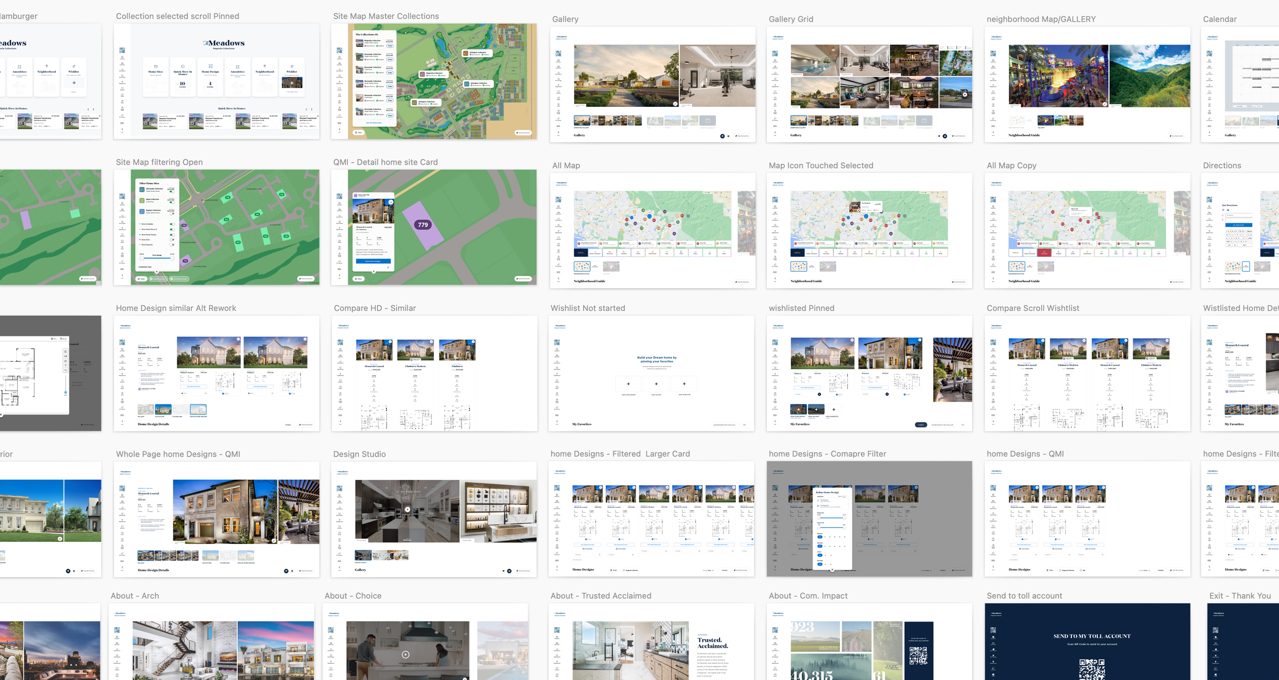
Iterations
Design & Development: A flexible, scalable site plan was created to accommodate varying amounts of community data, ranging from small developments to large, multi-phase projects. Real-time data integration was implemented to ensure home availability, pricing, and design options remained consistently up-to-date.
User Experience: The ISP was tailored for both guided sales presentations and independent browsing, with an intuitive interface that made it easy to explore site plans, filter home availabilities, and dive deeper into home design details.
Customization: Each community could feature its own branding and unique assets, such as lifestyle galleries, neighborhood maps, and nearby amenities. This customization enhanced the sense of place while maintaining a consistent user experience across all Toll Brothers communities.
Wireframing Exploration

Getting Feedback
Wireframes were reviewed, resulting in the decision to retain the familiar navigation bar to maintain the sales team's workflow.
Wireframing - refinement

Stess test - collection palettes

Revised wireframe collection iteration
Digital Registration Redesign ( Part Two)
DESIGN
Iterations
Our digital registration form lacked mobile optimization.
When homebuyers visited the sales center, they would scan the QR code to fill out a form for creating an Okta account, but had to scroll horizontally to complete it. The form was originally built on the Salesforce platform using Lightning components.
The Issue - Not Mobile Friendly

How to Solve
Utilizing Figma, I build three options based on lighting ui kit and Toll Brothers internal design system.

Chosen design

Outcome