Overview
A sales tool that needed to evolve with the buyers using it.
Toll Brothers sales centers rely heavily on an Interactive Site Plan (ISP) to showcase available home sites, community amenities, and Quick Move-In (QMI) homes to prospective buyers. The existing tool was outdated, difficult to navigate, and failed to support self-guided exploration or filtering.
Over 6+ months, I led UX and visual design end-to-end, from stakeholder discovery through final handoff — to modernize the ISP into an intuitive, interactive, and sales-accelerating tool for both buyers and sales consultants.
My Ownership on This Project
UX Strategy & Research
Stakeholder collaboration, usability audits of the existing kiosk, and feature prioritization planning
Wireframes & Prototyping
Created wireframe and prototypes from lo-fi sketches through interactive Figma prototype
Visual Design & Handoff
High-fidelity screens, component spec, and developer annotations within the Toll Brothers design system
Discover
The problem: a tool built for staff, not for buyers.
The existing ISP was a limited-interactive kiosk tool that required heavy sales consultant guidance. Homebuyers had no ability to explore homes independently or filter by availability or floor plan preferences. Sales reps often had to manually reference paper sheets or PDFs, interrupting the sales flow.
User research synthesis - pain points surfaced through stakeholder interviews and ISP usability audit.
Research Methods
- Stakeholder reviews - conducted sessions with multi teams to map ISP workflow and identify recurring failure points
- Kiosk usability audit - observed interactions with the existing tool during sales center visits, spoke to design consultants, noting issues and concerns
Key Findings
- Availability was unclear at a glance - users couldn't quickly distinguish which home sites were open, reserved, or sold.
- QMI homes were buried - Quick Move-In options were hard to find, reducing urgency and conversion on time-sensitive inventory.
- No comparison mode - no efficient way to evaluate homes side-by-side within the tool.
Define
Aligning user needs with business goals before touching the UI.
User Needs
- Browse at their own pace without relying on a sales rep
- Filter by preferences - plan, price, availability
- Visualize home site availability clearly and instantly
Business Goals
- Streamline home selection to shorten the decision-making cycle
- Promote Quick Move-In homes more effectively
- Reduce reliance on printed collateral and manual updates
Design Goals
Visually intuitive, filterable map
Create a map experience that buyers and sales reps can navigate confidently without training - with filters that feel obvious and immediate.
Highlight QMI homes and amenities
Quick Move-In homes needed a visual system that surfaced them prominently - not buried in a list, but present in the map itself.
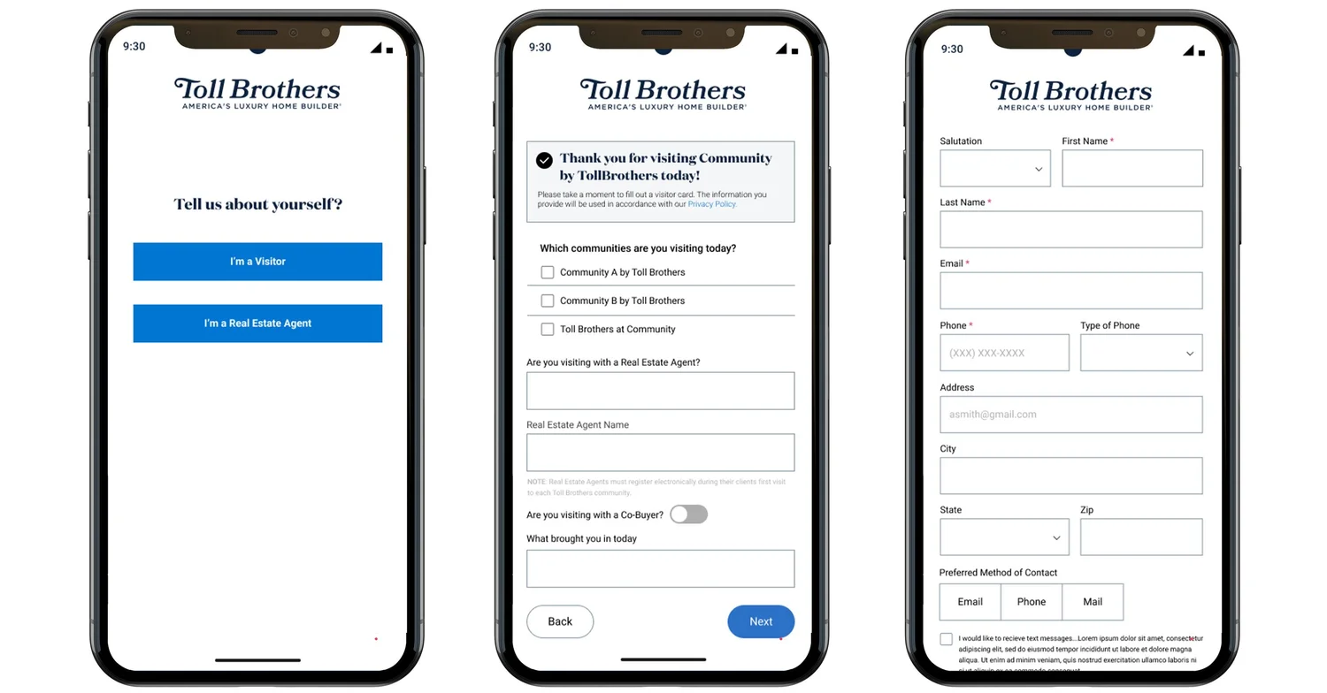
Redesign the registration flow
The existing registration process relied on a printed QR code scanned during design studio visits — a workflow that wasn't optimized for mobile use.
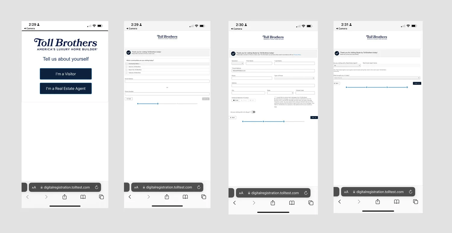
The existing digital registration - printed QR codes, disconnected from the buying context, not mobile-optimized.
Design Process
Ideation, wireframing, and iterating with real feedback.
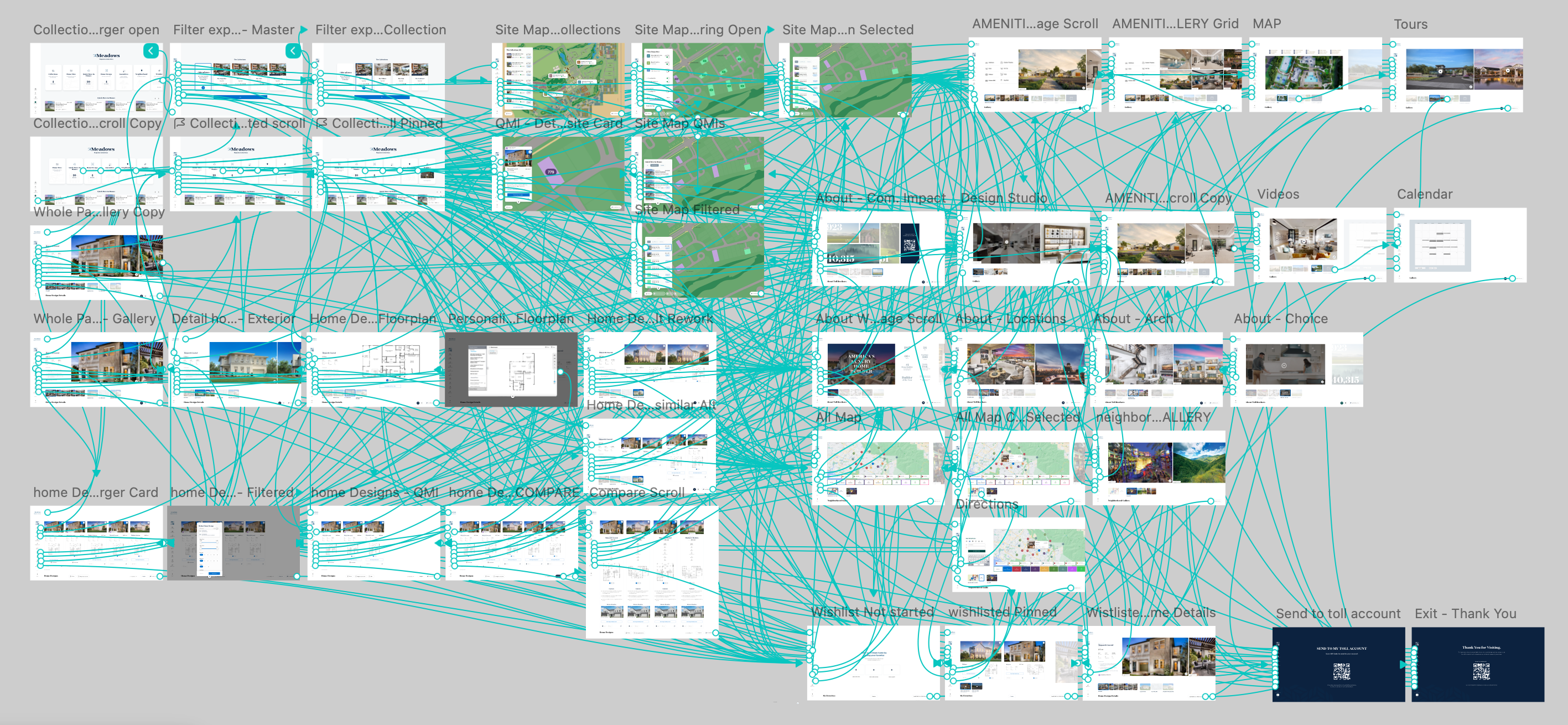
I began with a collaborative sketching session and created a feature prioritization matrix with stakeholders to align on MVP scope before touching wireframes. From there, I developed lo-fi prototypes to test layout, filtering logic, and map interactivity — iterating across two rounds of stakeholder review before moving to high-fidelity.
Key Features Explored
- Home site filters by plan, price, availability, and QMI status
- Tap-to-view home detail panels with photos, specs, and pricing
- "Favorites" functionality for saving top picks during a tour
- Dedicated Quick Move-In cards surfaced on the home screen
- Simplified digital registration with integrated QR code — no more printing
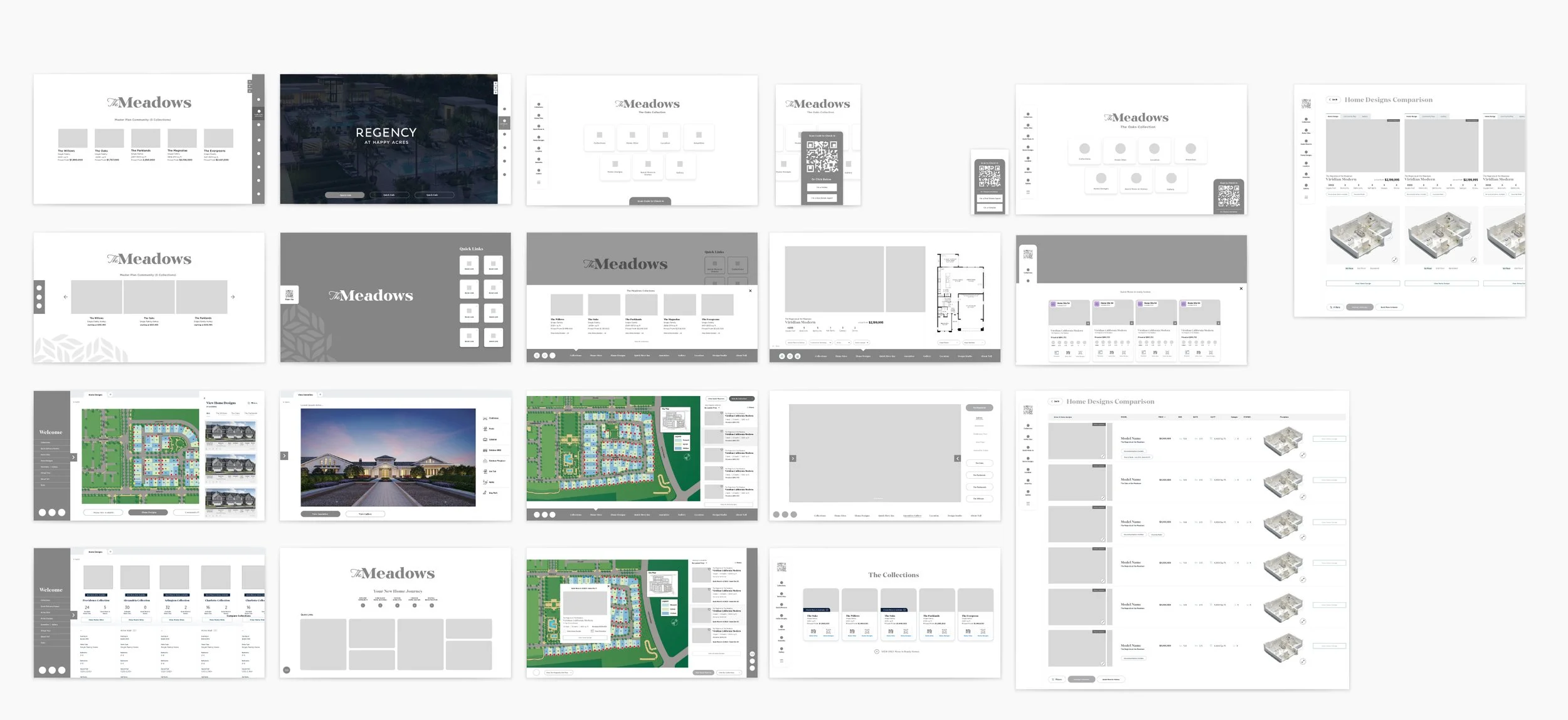
Exploration
Mid-fidelity explorations - testing layout, panel structure, and filter interaction before moving to high-fidelity.
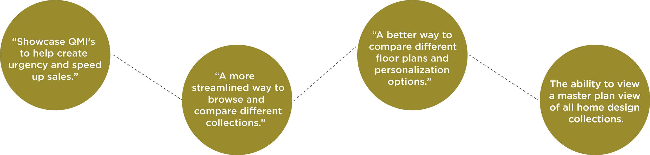
"Emphasizing time-sensitive inventory (QMI, limited lots) improved discoverability and created natural urgency."
Key Insights from Testing
- Users strongly preferred a persistent map with dynamic filters over tab-based navigation or full-page list views.
- Digital registration needed to be shorter, more contextual, and triggered at the right moment in the journey — not as a gate.
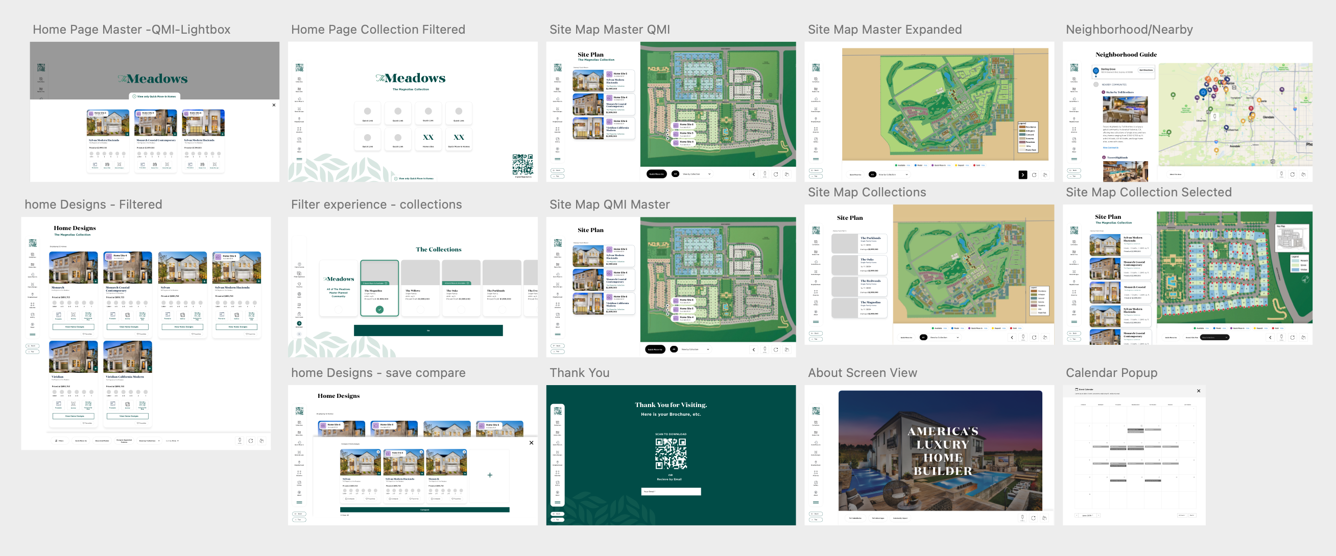
High-fidelity explorations
Before vs. After
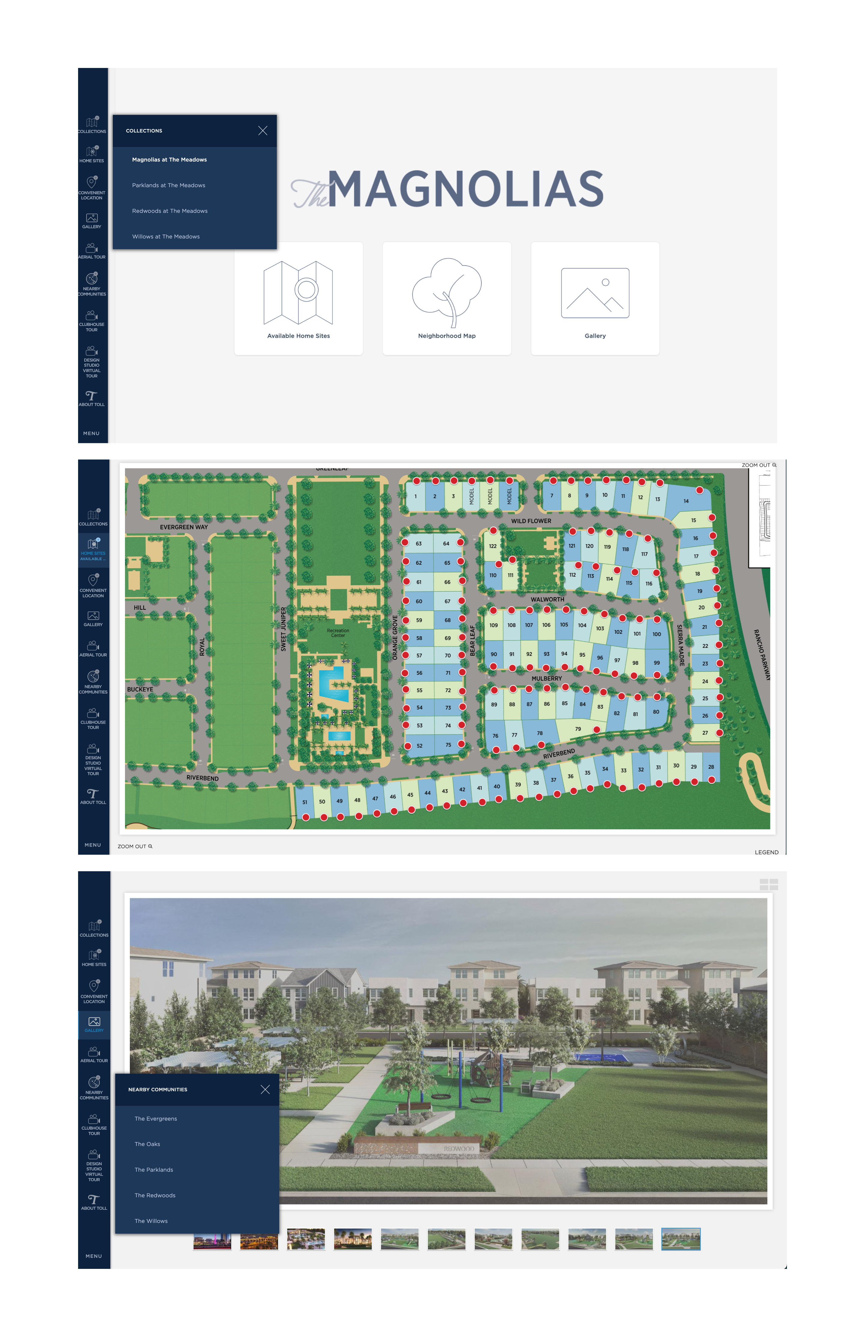
Redesigned - availability status clear at a glance, QMI surfaced prominently, self-guided filtering enabled.
Key Design Decisions
Persistent map with dynamic overlay filters rather than tab navigation. Testing confirmed buyers needed to keep spatial context while filtering — switching away from the map broke the mental model of "where is this lot relative to the entrance/amenities."
Favorites and comparison mode were scoped in the initial brief but deferred to Phase 2. Reason: engineering timeline constraints and the need to validate core filtering before layering saved-state features. This is noted in Next Steps.
QMI badge system across all surfaces - map pin, filter result card, and detail panel — rather than just a filter toggle. Sales consultants flagged that buyers often didn't know to look for QMI; surfacing the badge proactively created urgency without requiring them to search.
Printed QR code kiosk gate removed entirely. The existing registration required a consultant to initiate a printed QR handoff - a 3-step process that interrupted tour momentum. Replaced with inline digital registration triggered contextually from the detail panel.
All components followed the Toll Brothers design system and accessibility standards, ensuring consistency and scalability across community sales centers regardless of market or screen size.
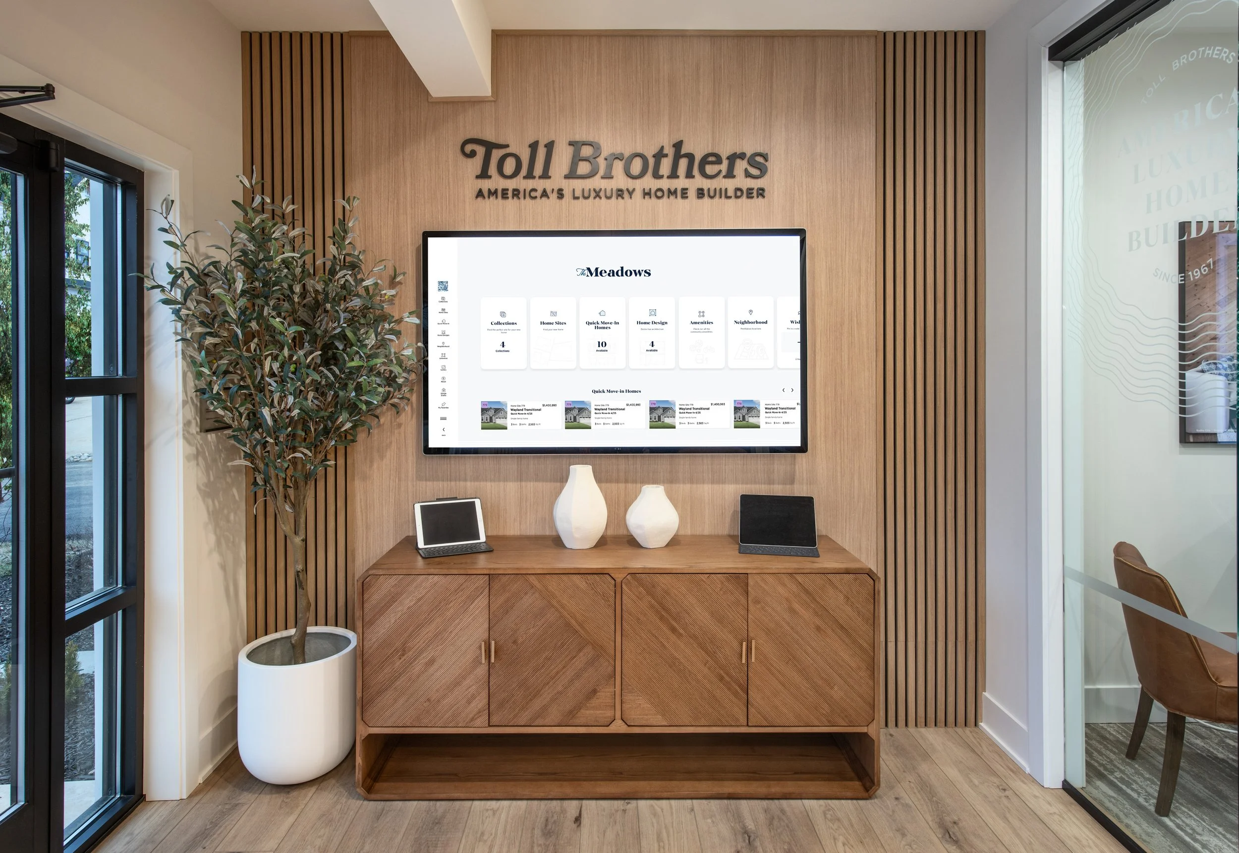
Final Solution
An interactive map that sells — not just shows.
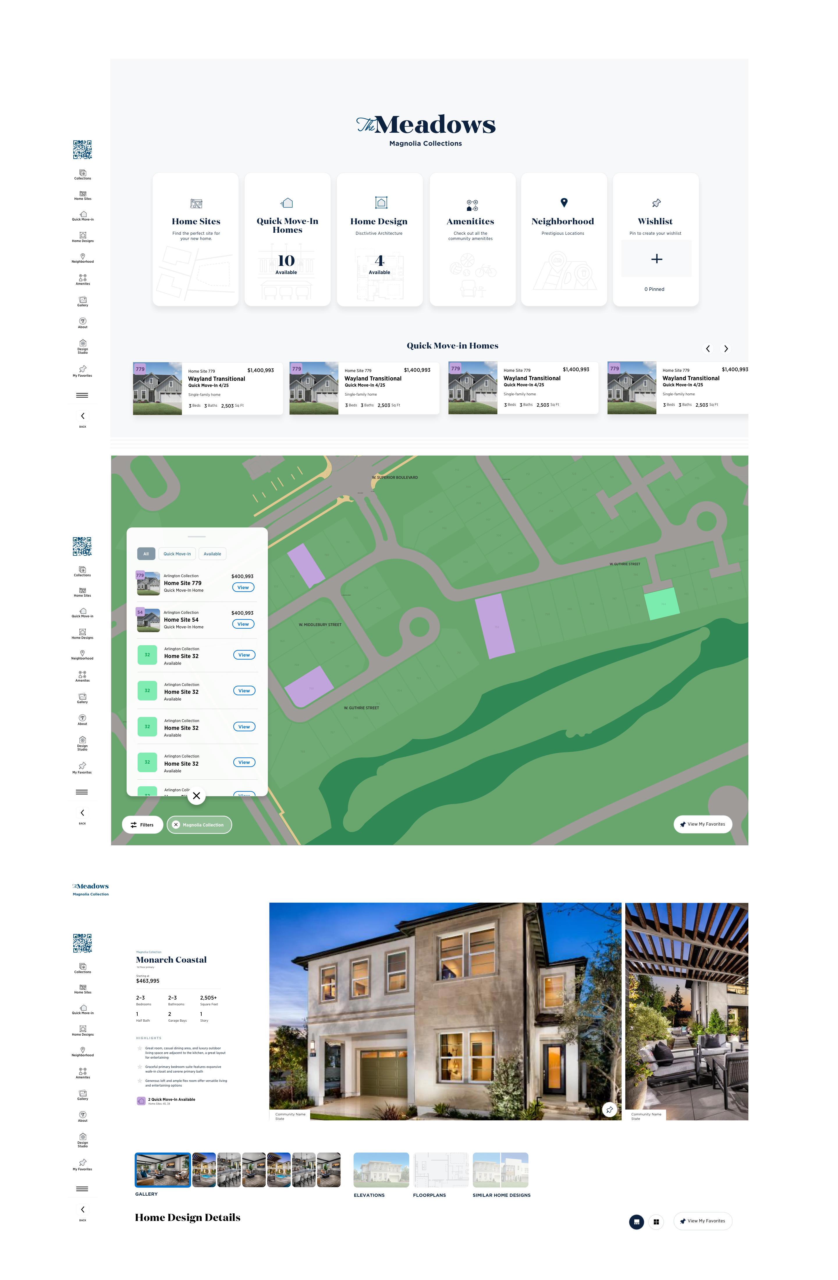
The final design delivered a cohesive, responsive experience that empowers buyers to explore on their own while giving sales consultants a faster, more reliable tool to answer questions in the moment.
Interactive, responsive map with availability filters
A persistent map with real-time filter controls — buyers can narrow by plan type, price range, availability status, and QMI. The map responds instantly, keeping the spatial context always visible.
Visual badges for Quick Move-In homes
QMI homes are surfaced with a distinct visual badge system that's present on the map, in filter results, and in the detail panel. Time-sensitive inventory is no longer buried.
Tap-to-view overlays with home and site info
Selecting a home site opens a contextual detail panel with photos, floor plan, pricing, lot dimensions, and a direct path to schedule a tour or register interest — without leaving the map.
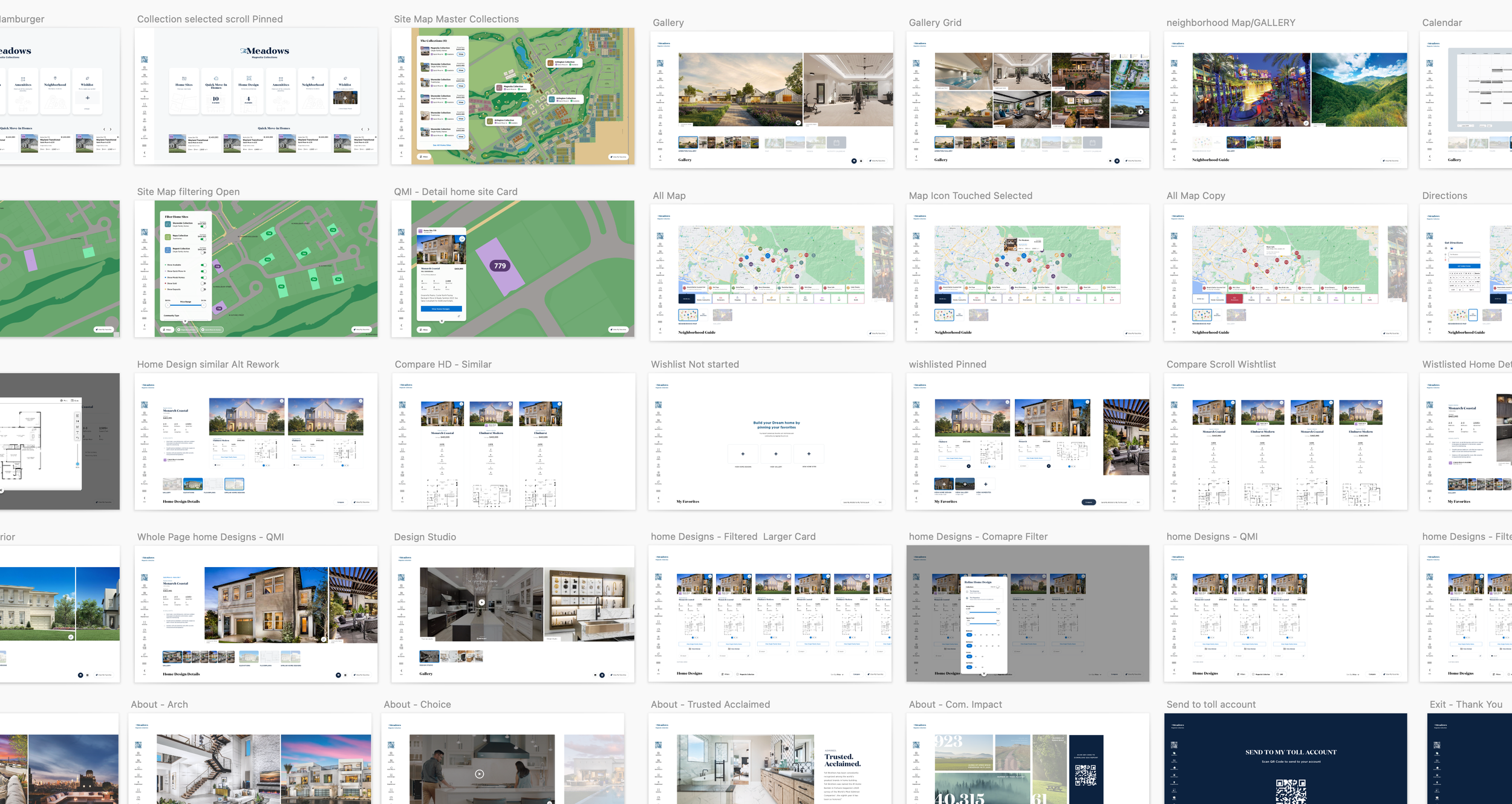
Final screens: desktop and tablet views of the redesigned Interactive Site Plan.
Mobile view: the experience designed to work as well in-hand as it does on a kiosk.
Outcomes
Reflection & Next Steps
What I'd do differently — and where we're heading next.
This project reinforced the importance of designing tools that empower both users and internal teams. The ISP sits at a critical moment in the buying journey, it's often the first time a buyer moves from browsing to believing and that moment deserves a tool that earns the trust being placed in it.
Looking Ahead
- Building out a favorites and comparison feature that persists across sessions, letting buyers pick up where they left off between visits. (Deferred from v1 — scoped and ready for Phase 2.)